 ITとCFD入門サイト
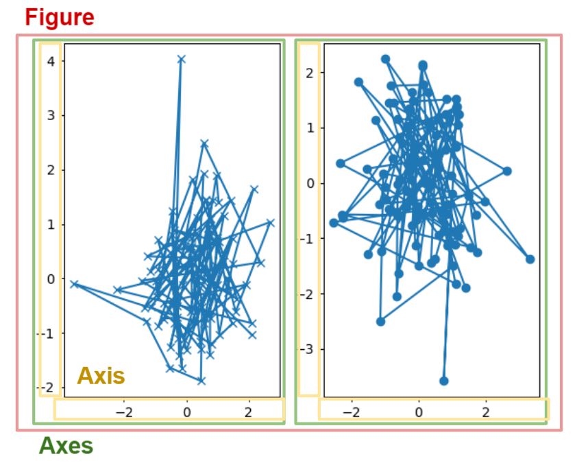
pythonの大きな強みとして、matplotlibが挙げられます。matplotlibはグラフ描画ライブラリであり、pythonではこれが簡単に使用することができます。
pythonでは当たり前のように感じますが、他の言語ではグラフ描画すごく大変です。別途ライブラリをインストールする必要があったりします。それがpythonでは簡単にグラフが書けるので重宝されているわけです。
今回はこのグラフ描画ライブラリであるmatplotlibについて解説します。きちんと理解できるように基本的な内容から説明していきます。
2つの記述スタイル
まずはじめに知っておくべきは、matplotibの2つの記述スタイルです。
1つ目がオブジェクト指向スタイルです。下記のように、figやaxといった変数が出てくるのが特徴です。複雑そうに見えますが、細かく手を加えることができます。
x = np.linspace(0, 2, 100)

fig, ax = plt.subplots()  # Create a figure and an axes.
ax.plot(x, x, label='linear')  # Plot some data on the axes.
ax.plot(x, x**2, label='quadratic')  # Plot more data on the axes...
ax.plot(x, x**3, label='cubic')  # ... and some more.
ax.set_xlabel('x label')  # Add an x-label to the axes.
ax.set_ylabel('y label')  # Add a y-label to the axes.
ax.set_title("Simple Plot")  # Add a title to the axes.
ax.legend()  # Add a legend.
もう一つがpltスタイルです。こちらは簡易的な機能しか入っていませんが、直感的に操作することができます。MATLABを参考に作成されています。
x = np.linspace(0, 2, 100)

plt.plot(x, x, label='linear')  # Plot some data on the (implicit) axes.
plt.plot(x, x**2, label='quadratic')  # etc.
plt.plot(x, x**3, label='cubic')
plt.xlabel('x label')
plt.ylabel('y label')
plt.title("Simple Plot")
plt.legend()
ちなみにどちらも出力結果は同じです。下記のようなグラフができます。

このように、2つの記述スタイルがあり、基本的には2つは用途に応じて分けて使用します。どちらを使用しても良いですが、pltスタイルに関しては機能をググってもらうだけで簡単に使用できると思うので、今回はオブジェクト指向スタイルについて解説していきます。
オブジェクト指向スタイル
オブジェクト指向スタイルについて理解するためには、コンテナとプリミティブという2つの要素について知る必要があります。
コンテナとは、たくさんの要素を含む要素のことです。イメージとしては、フォルダになります。コンテナについて理解しておかないとmatplotlibを扱うのは難しいです。
コンテナはFigure、Axes、Axisの3つの構造になっています。Figureが作成する図全体を指します。そして、Axesが一つのグラフを指します。Axisは一つの軸を指します。
プリミティブは、コンテナ内のメソッドを指します。イメージとしては、フォルダ内にあるファイルです。legend()で凡例を表示したり、xlabel()で軸ラベルを表示したりしていると思いますが、これはプリミティブになります。コンテナを無視してプリミティブだけを使用する方法がpltスタイルとも言えます。
コンテナ構造
コンテナ構造を理解することで、matplotlibでの操作が理解しやすくなります。ここではFigure、Axes、Axisの3つのコンテナについて説明します。
まずは図でイメージを持ちましょう。Figureは図全体、Axesはグラフ単体、Axisは軸単体のメソッドを含むコンテナです。

Figureは図全体に対するメソッドを持つコンテナです。matplotlibでは、1つの図に2つ以上のグラフを描くことができます。Figureでは描いたグラフ全てに対して影響を与える機能が入っています。また、Figureと後で説明するAxesでは、参照にしているのが図とグラフで異なるので、基準座標位置が違うという特徴もあります。
Axesはグラフ一つずつに対するメソッドを持つコンテナです。例えば、グラフを描くときにxy軸の変数を与えてグラフを作成するax.plot(x,y)はこれに当たります。axesはmatplotlibの3つのコンテナの中で最も使用します。
Axisは軸に関するメソッドを持つコンテナです。軸一つに対してAxisが対応しているので、x軸とy軸では別途指定する必要があります。
例のコードを見る
今回の例のコードを見ながら、何が書かれているのかを理解していきましょう。
x = np.linspace(0, 2, 100)

fig, ax = plt.subplots()  # Create a figure and an axes.
ax.plot(x, x, label='linear')  # Plot some data on the axes.
ax.plot(x, x**2, label='quadratic')  # Plot more data on the axes...
ax.plot(x, x**3, label='cubic')  # ... and some more.
ax.set_xlabel('x label')  # Add an x-label to the axes.
ax.set_ylabel('y label')  # Add a y-label to the axes.
ax.set_title("Simple Plot")  # Add a title to the axes.
ax.legend()  # Add a legend.
1行目は配列作成なので、説明は省略します。ちなみにmatplotlibとnumpyをインポートしておいてください。
fig, ax = plt.subplots() # Create a figure and an axes.
plt.subplots()によって、FigureとAxesを生成します。基本的にFigureはfig、Axesはaxと略されます。
ax.plot(x, x, label='linear')  # Plot some data on the axes.
ax.plot(x, x**2, label='quadratic')  # Plot more data on the axes...
ax.plot(x, x**3, label='cubic')  # ... and some more.
ax.set_xlabel('x label')  # Add an x-label to the axes.
ax.set_ylabel('y label')  # Add a y-label to the axes.
ax.set_title("Simple Plot")  # Add a title to the axes.
ax.legend()  # Add a legend.
これらは全てAxes(ax)の機能を使用しています。つまり、グラフに対する処理です。上3つのax.plot()はグラフ線を書いています。1次関数、2次関数、3次関数のグラフです。その下のax.set_xlabel()、ax.set_ylabel()が軸ラベルです。一番下のax.legend()は凡例を表します。
今回はAxisに関しては変更していませんが、軸目盛り等の変更に際に使用することがあります。
おわりに
今回はmatplotlibについて解説しました。
youtubeでもPythonに関する動画を出しています。そちらもどうぞ。
参考:
https://matplotlib.org/stable/tutorials/introductory/usage.html#sphx-glr-tutorials-introductory-usage-py